


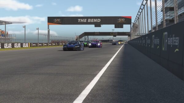
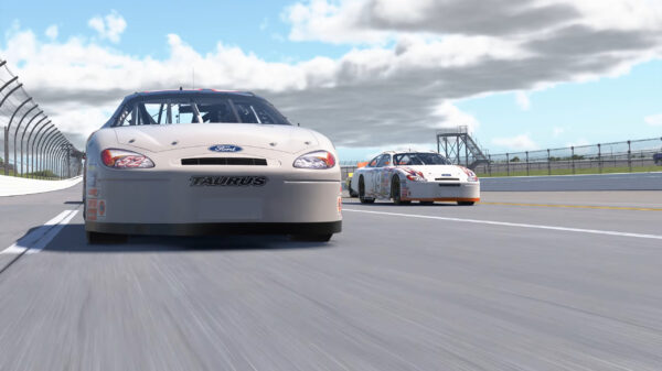
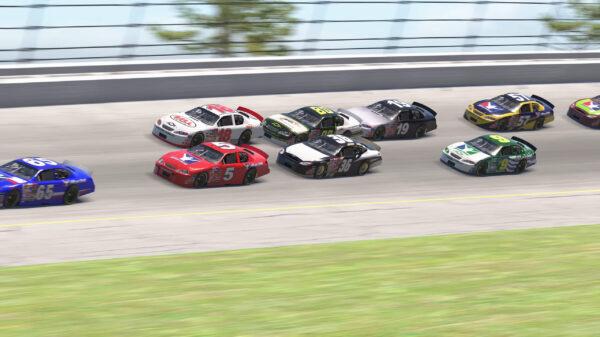
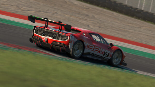
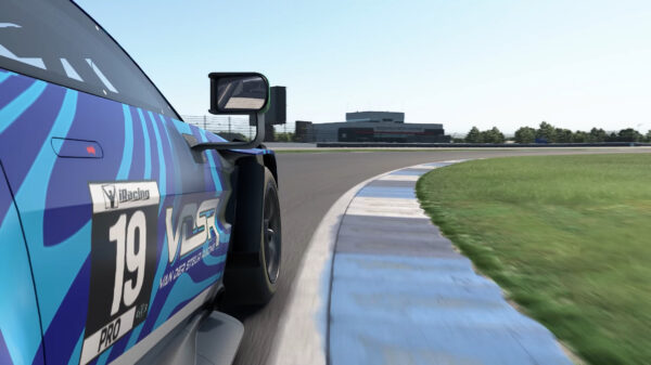
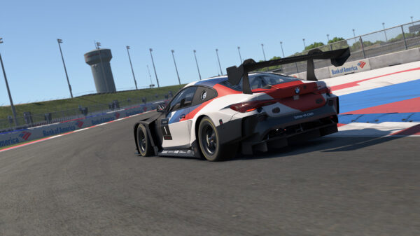
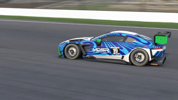


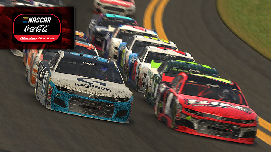

With big changes come big opinions. The new iRacing Sim UI, released in September 2025, has drawn a mix of excitement, cautious optimism, and outright frustration from the community. Here’s a breakdown of what sim racers are saying — the positives, the negatives, and the hopes for what comes next.
What Users Like
A Fresh, Modern Look
Many racers praised the updated visuals, calling the interface cleaner and more contemporary compared to the old design.
Richer Data
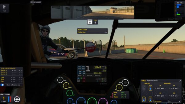
New graphs and charts, such as Strength of Field and participation trends on series pages, have been especially well received.
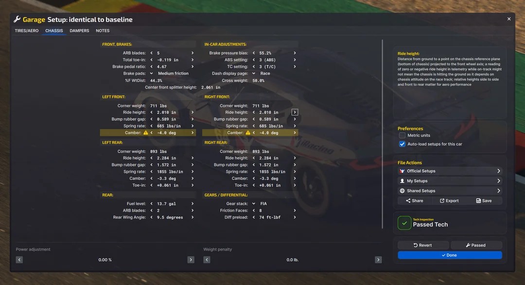
Customization
Movable, resizable black boxes and new opacity controls were described as long-awaited quality-of-life improvements.
Tooltips and Clarity
The addition of hover tooltips and clearer option descriptions makes learning the sim easier, particularly for newcomers.
Familiar Foundations
Despite the redesign, basic workflows like joining sessions and adjusting pit strategy still feel familiar.
What Users Dislike
Extra Clicks and Hidden Information
Common complaints include more steps to accomplish simple tasks, such as viewing eligible cars or checking race lengths. Some details, like estimated race end times, are missing altogether.
Navigation Issues
Tiny navigation buttons and unintuitive back arrows left many frustrated when trying to move between pages.
Performance Problems
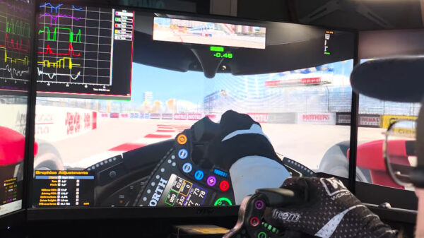
Users reported slower loading, stuttering, and lag in the UI, particularly when browsing sessions. VR users were hit hardest, with complaints about tiny, unreadable text and reduced performance.
No Revert Option
Those unhappy with the new system were frustrated by the inability to fall back to the old UI.
Bugs and Oversights
Reports included washed-out virtual mirrors, scaling sliders not functioning as intended, and unintuitive menus like weather forecasts hidden behind small buttons.
Overall, reactions are divided. Some see the new UI as a necessary leap forward and are willing to tolerate a learning curve and early bugs. Others feel it’s a downgrade in usability, describing it as “90% there but the 10% that’s bad ruins the entire experience.”
The iRacing community has voiced both enthusiasm and disappointment in the wake of the Sim UI release. The positives — modern design, more data, and customization — show clear progress, while the negatives highlight the importance of usability and performance. With developers actively seeking feedback, many hope that upcoming patches will resolve the pain points and deliver on the potential of this ambitious overhaul.